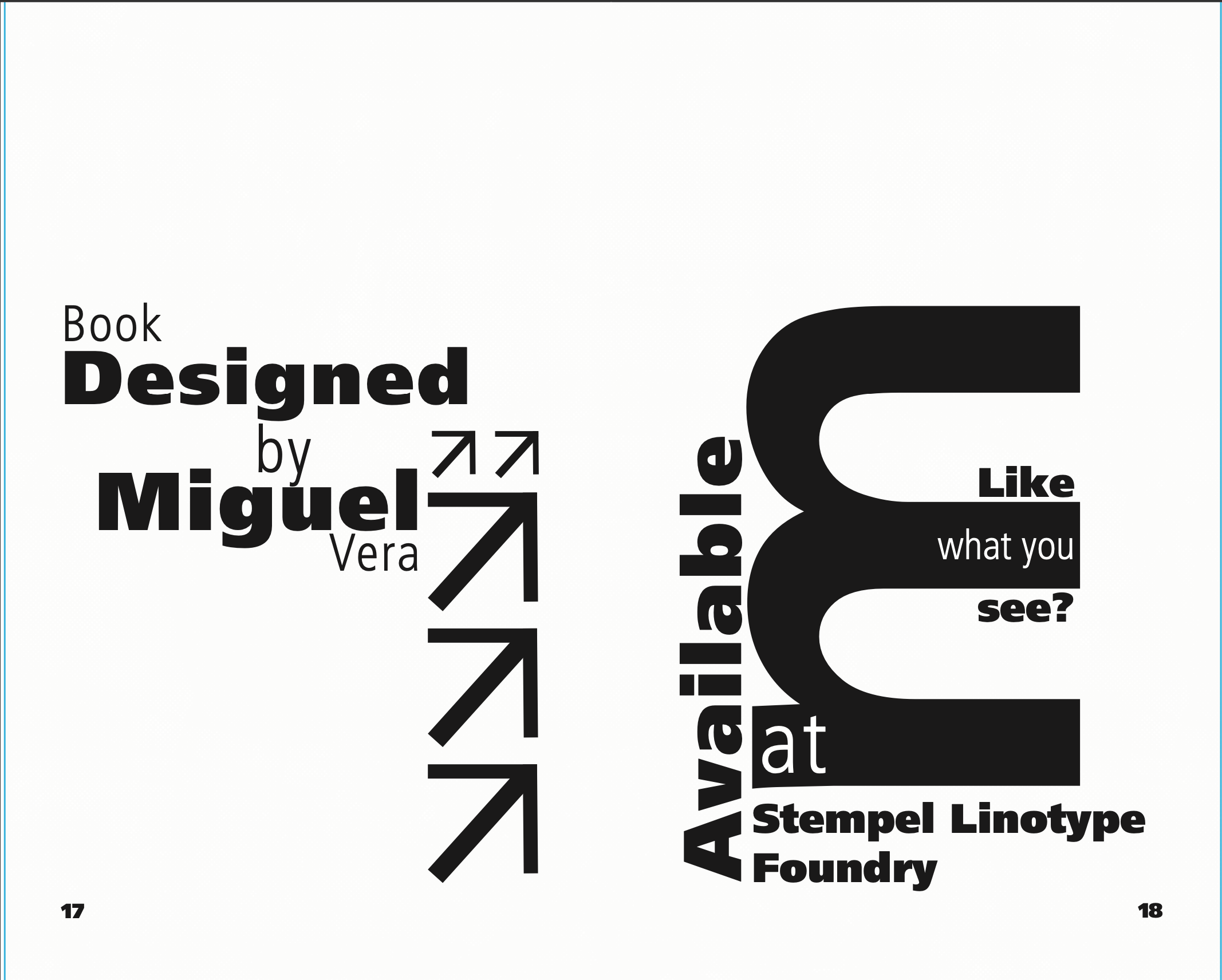
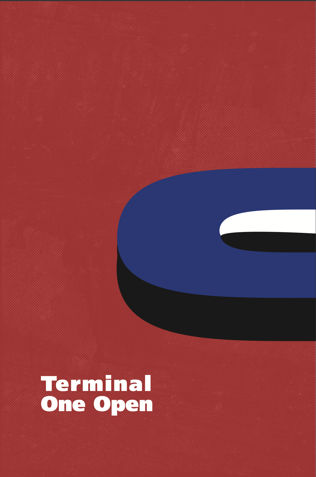
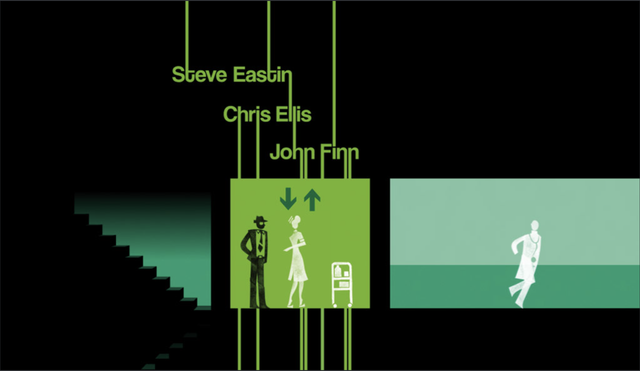
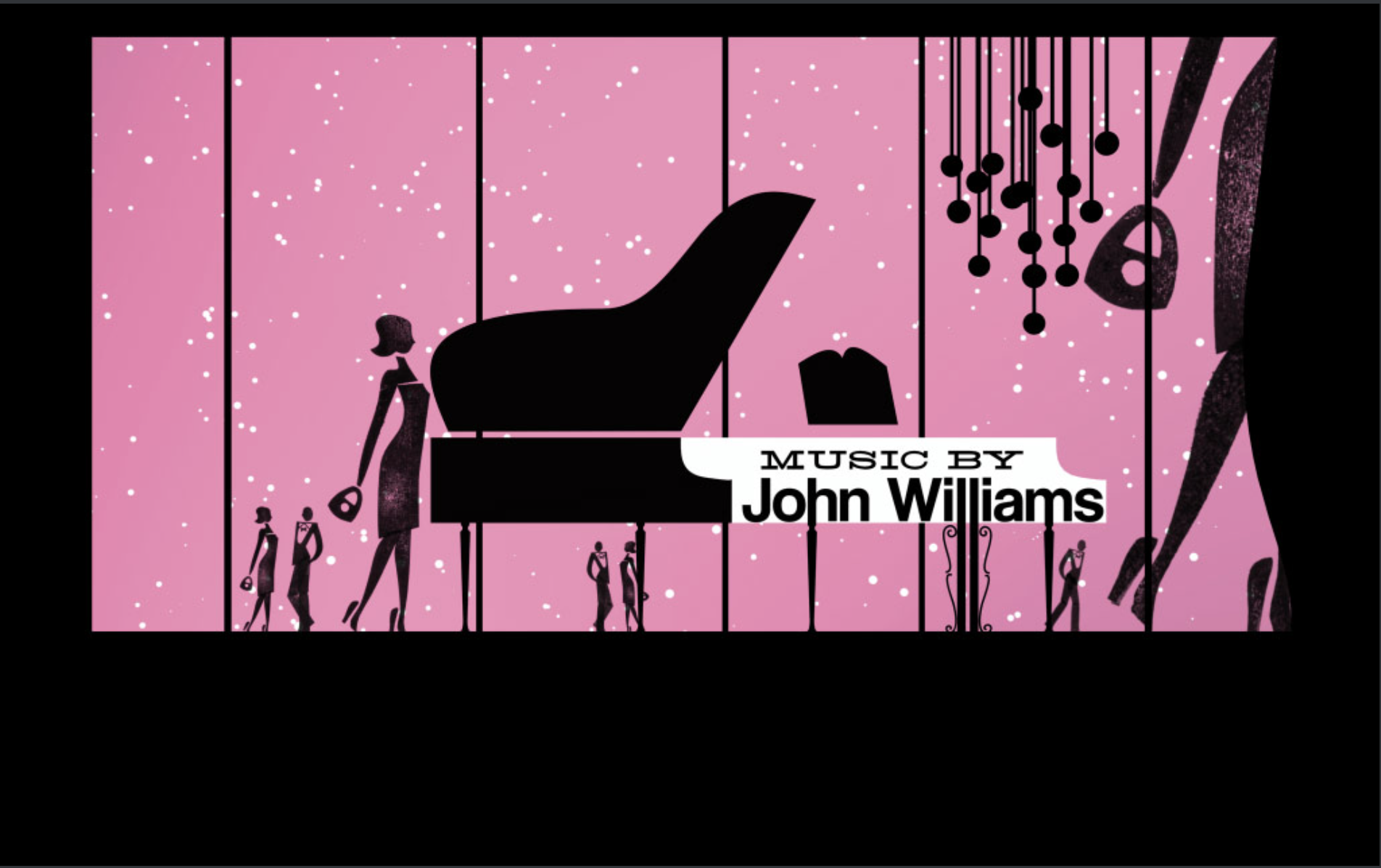
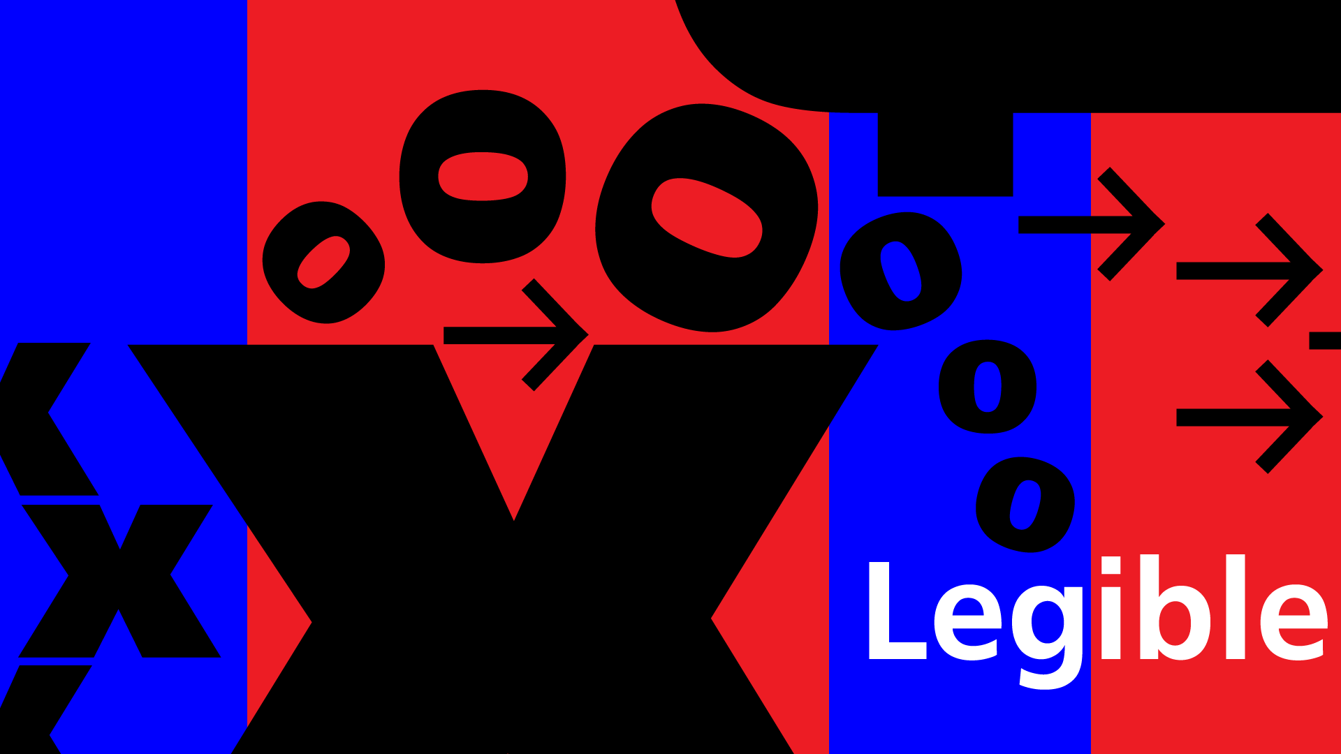
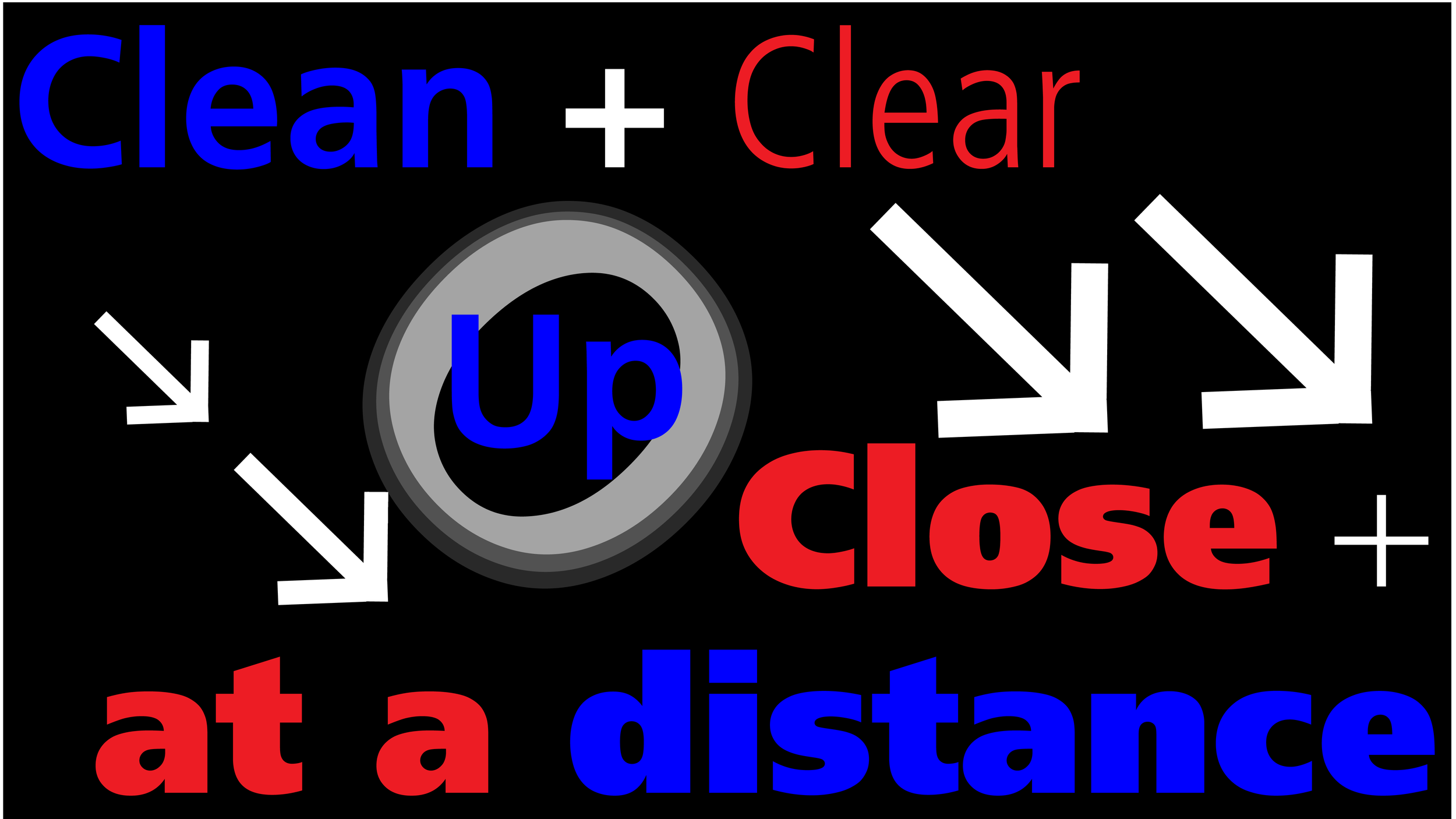
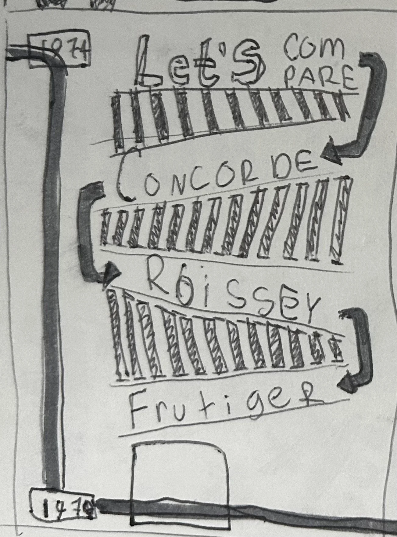
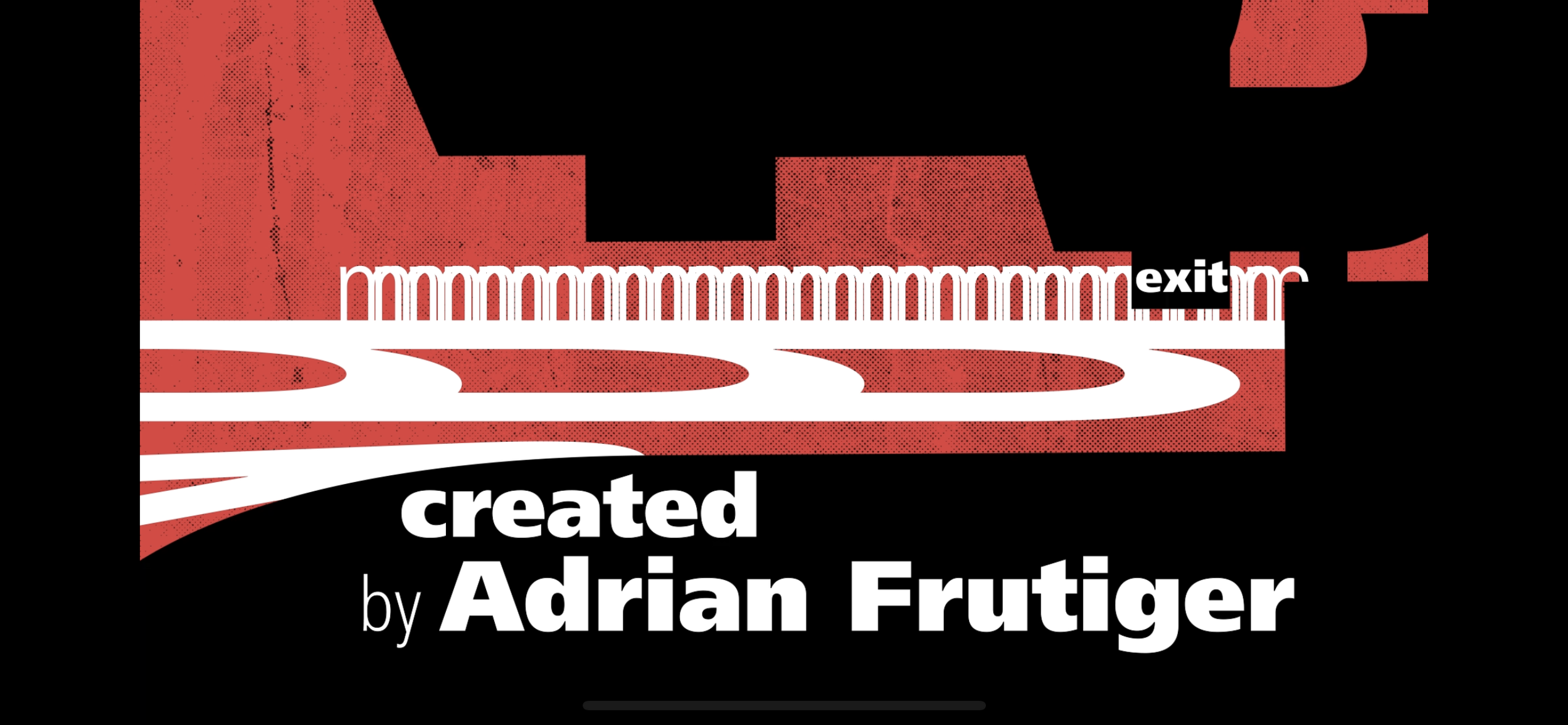
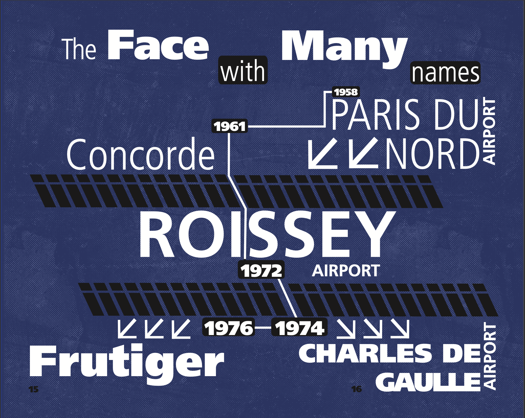
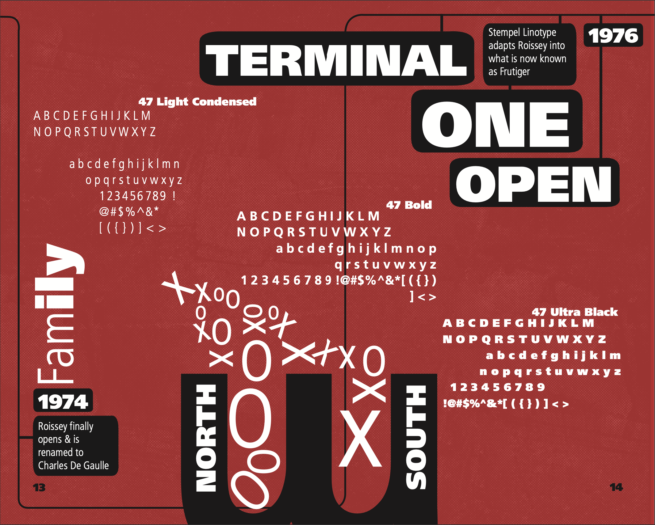
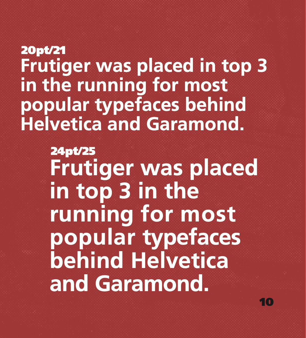
Layout design for “Frutiger” type specimen booklet that doubles as retelling of the typefaces origins in France. The typeface went by many names before it was fully realized for CDG Paris airport. Accompanying animation that expands on the origin story by incorporating art styles that evoke Saul Bass’ work that influenced the opening animation of feature film “Catch me if you can”
Frutiger Type book
Type Book Cover
Visual inspiration
Early style frames
final style frames
Print Layouts
-
As an inaugural board member, my goal is to establish a tone, feel, & visual identity that is memorable to the audience of student body. This had to include, logo, slogan, and colors that could be easily to identify. This had to represent not only skateboarders but roller blades with the fun, casual, and open spirit environment we desired to cultivate.
-
Through research, we found that while a plethora of stylistic inspiration is present in skateboarding culture, and used that to dictate type choice, and texture choices.
We found some inspiration in existing skate clubs in other places & took an existing logo, dissected what worked, and elaborated into our own.
By blending 3 marks that could work modularly by existing independently & as one, it provided broader opportunity for deployment. Grittiness was introduced by incorporating texture
-
Through the implementation, the why is to establish cohesive visual communication. This provided solutions that generate constant excitement for merchandise, events, and announcements.

