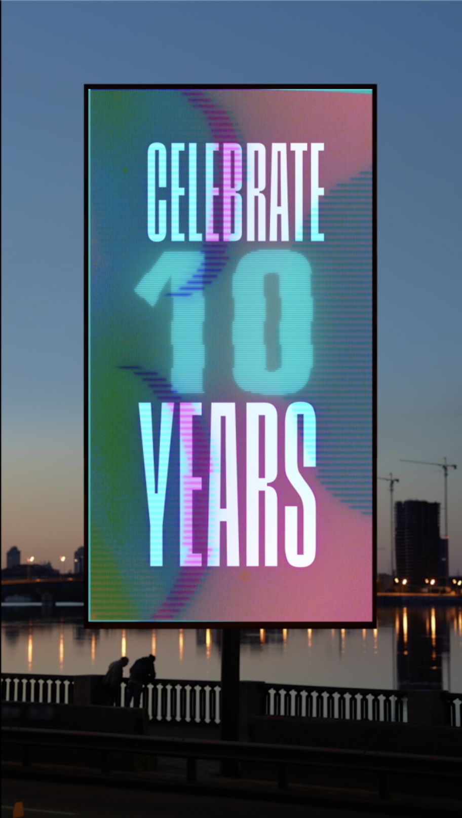
As a Jazz fan; I was ecstatic to bring the iconic design of Reid Miles of Blue Note Jazz to the world of Rolling Loud Festival. The premier hip hop festival that was established by two friends from Miami 10 short years ago.
Rolling Loud Music Festival
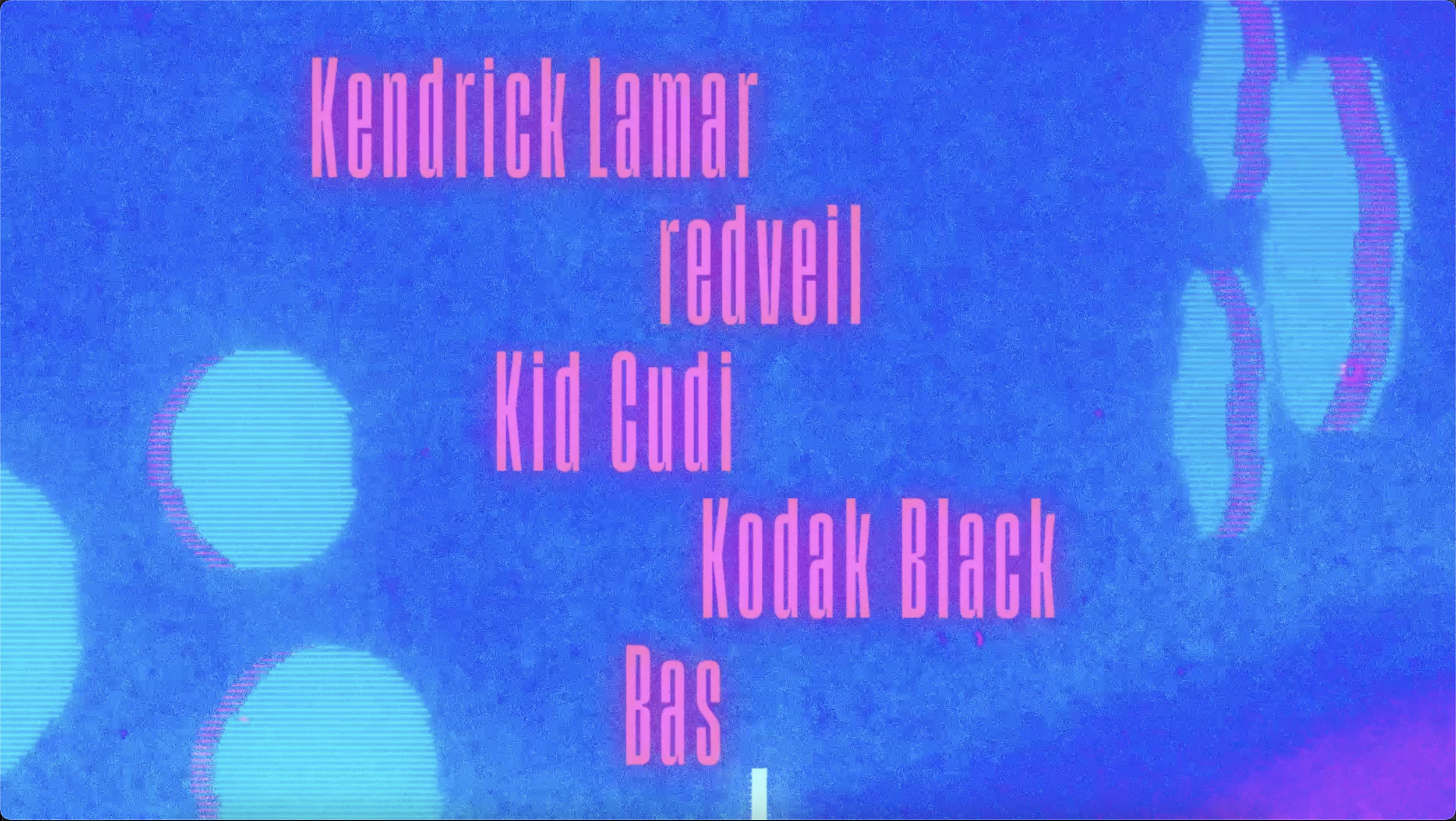
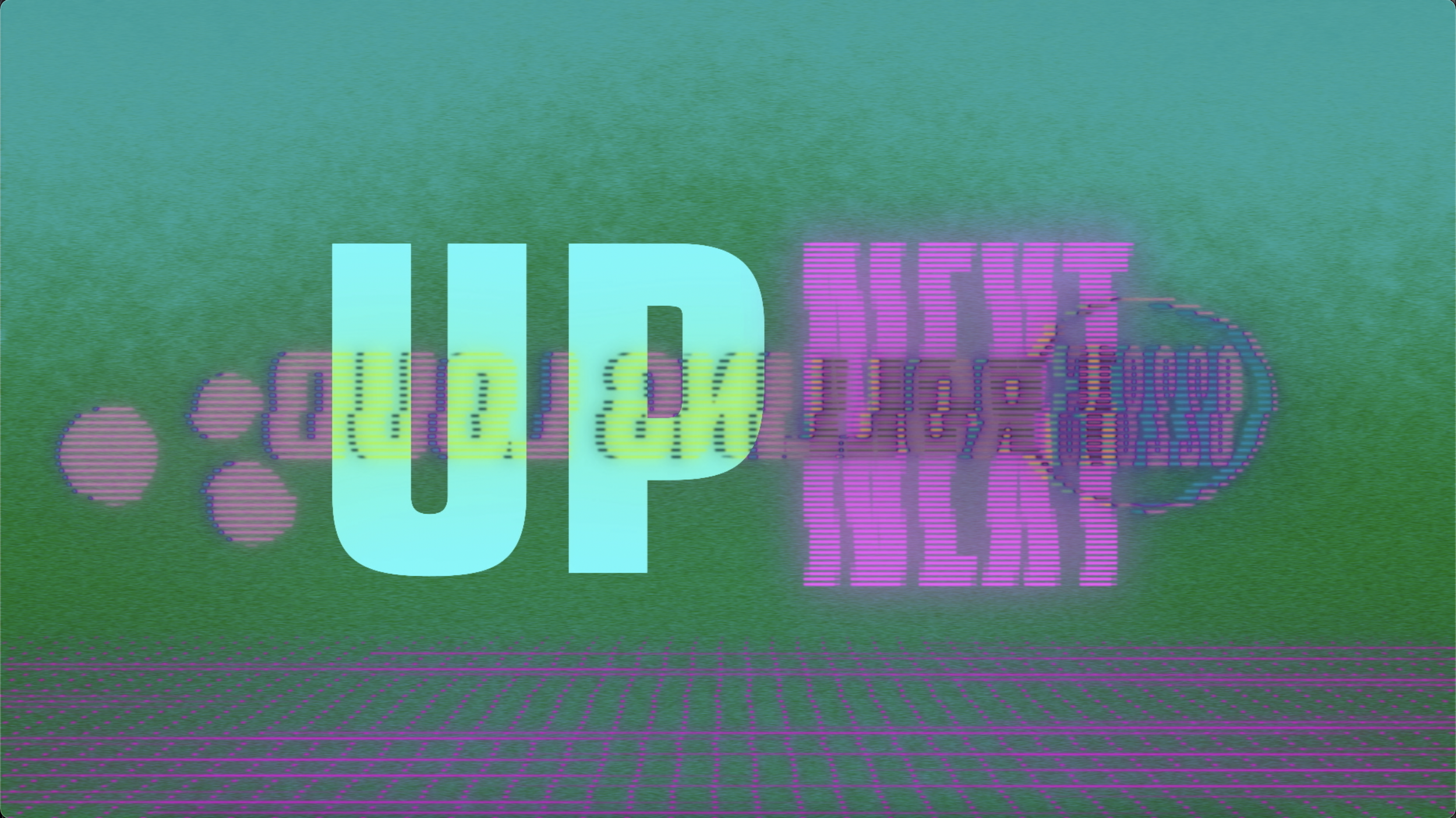
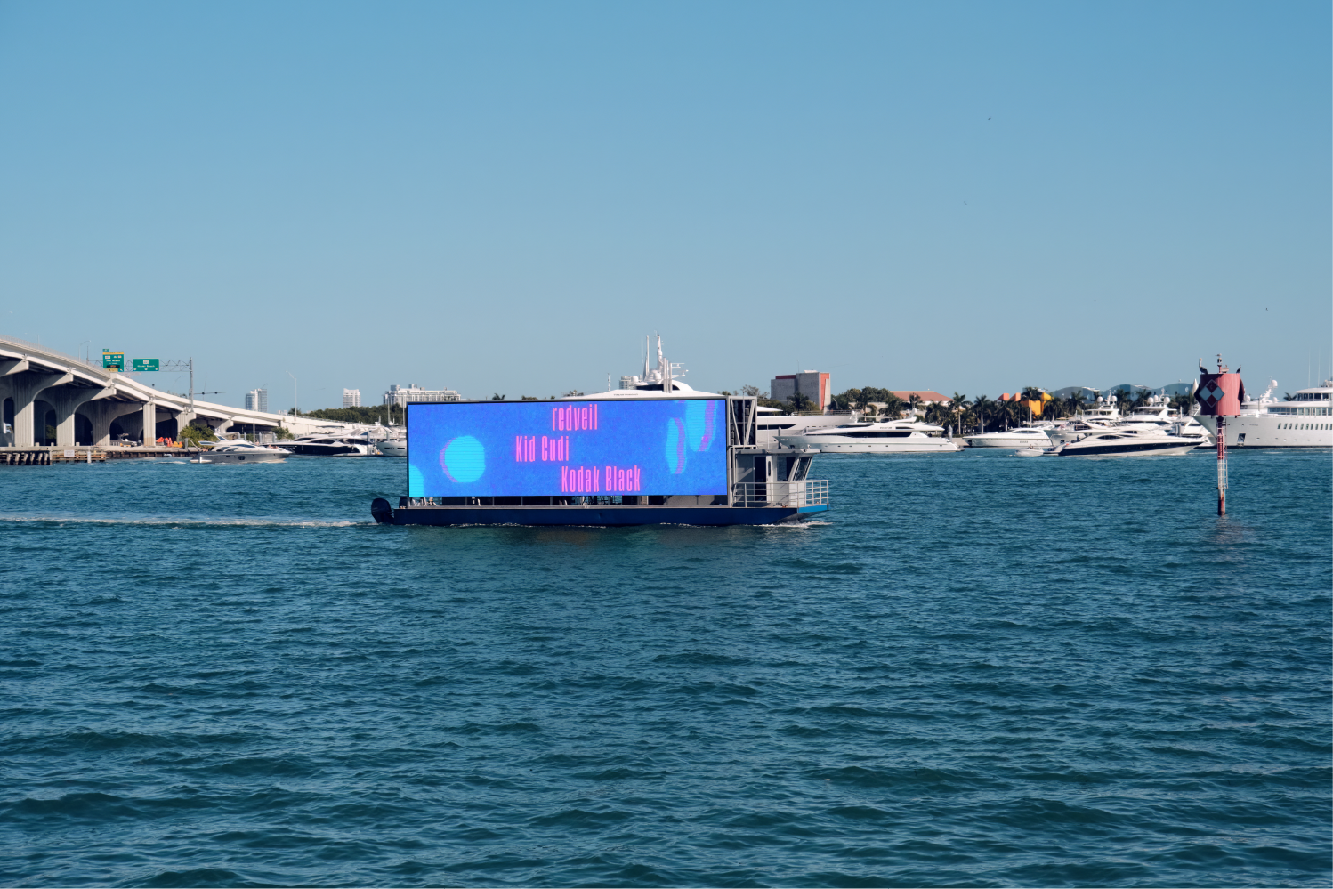
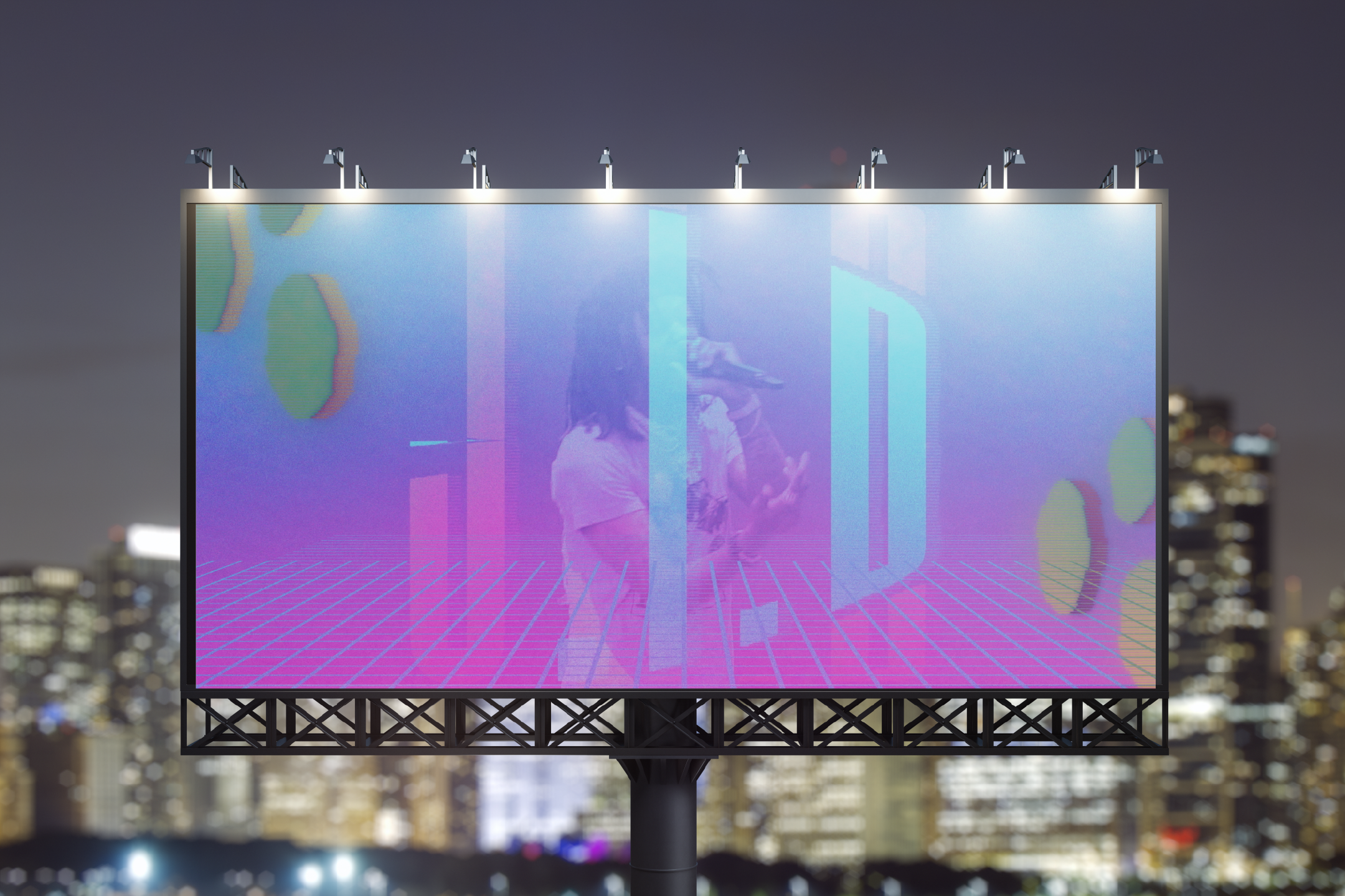
The ask was to build out three separate animations that brought together these two worlds. Two activations from within the festival, one meant to welcome fans, and another to announce the upcoming artist to the stage. The third should be an outdoor billboard activation that showcases the artists participating in the festival.
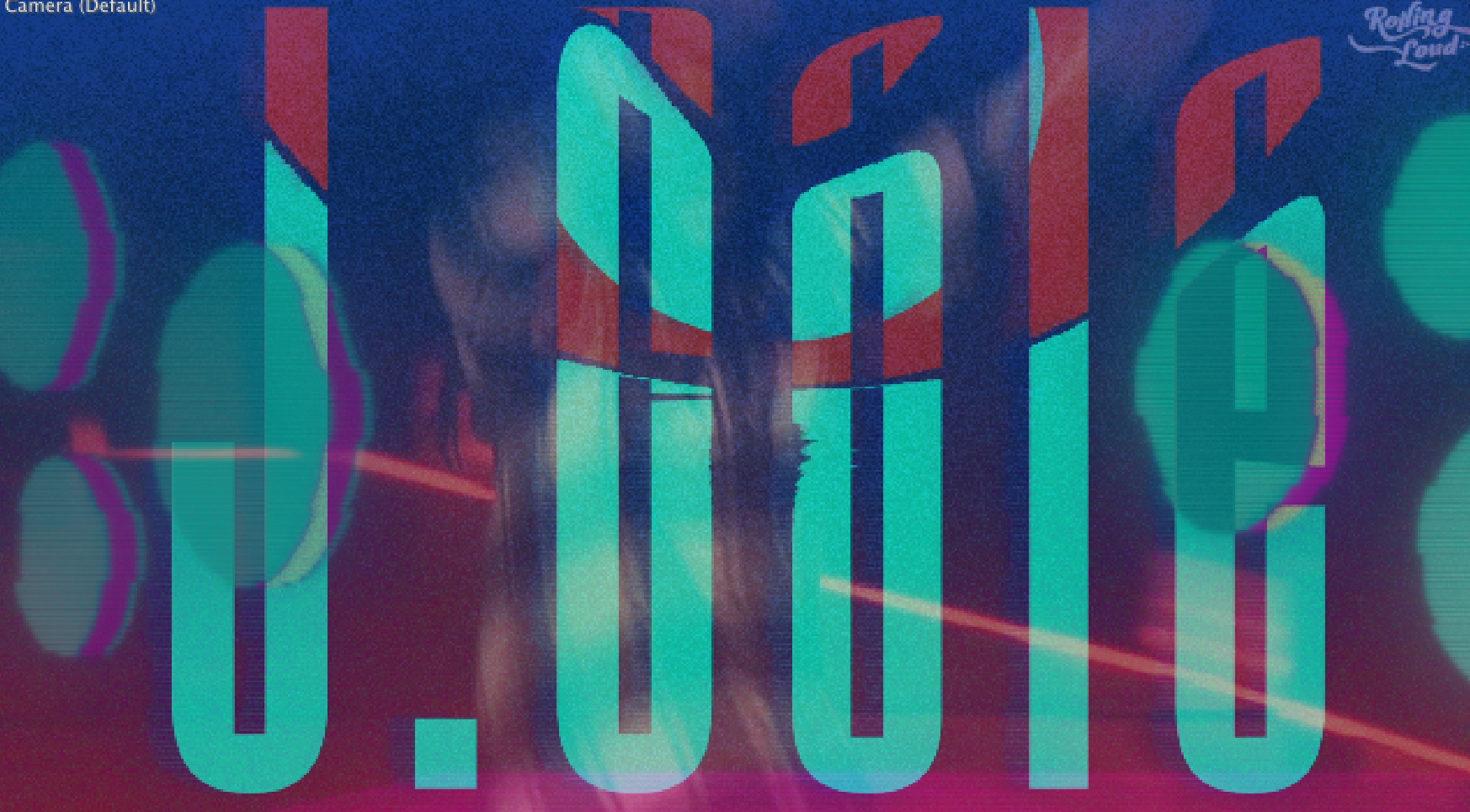
Redesigned wordmark
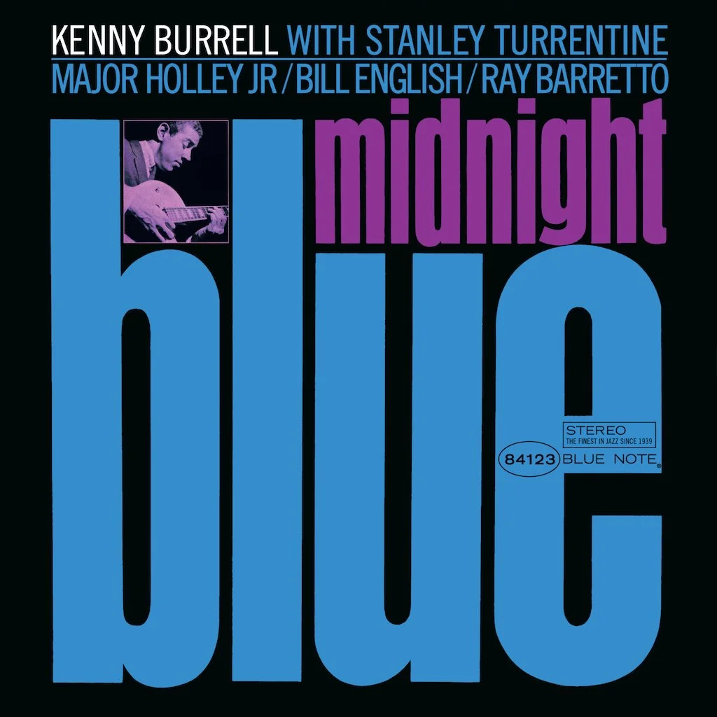
As such, it felt right to use existing elements of the visual identity such as the primary typeface and blend it with the oversized type treatment of albums like “Midnight Blue” by Keith Burrell.
Original
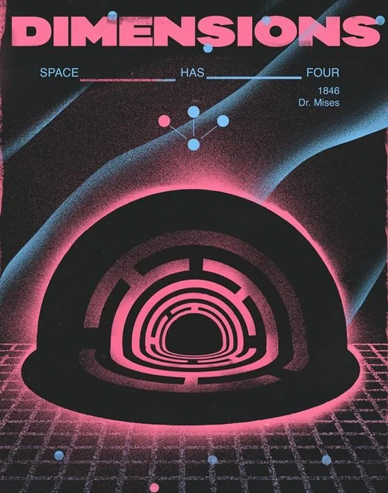
Inspiration
Visual tests
Given that the album has hot pink and blue that is connected with Miami & Vaporwave, everything worked out.
final style frames
final style frames
-
As a Festival, rolling loud is quite young. It was founded in 2015 buy two high school friends. In ten short years, it’s expanded to multiple festival in different countries, and continents.
For their upcoming 10 year anniversary, they looked to revamp their branding into something that celebrate this milestone while making sure to solidify their spot in the event entertainment.
The ask was to build out three separate animations that brought together these two worlds.
-
With the business being established in Miami, the kind of high contrast colors combinations & vibrant typography connected to it form a solid foundation.
As such, it felt right to use existing elements of the visual identity such as the primary typeface and blend it with the oversized type treatment of albums like “Midnight Blue” by Keith Burrell.
-
Through the implementation, the why is to establish cohesive visual communication. This provided solutions that generate constant excitement for merchandise, events, and announcements.


