I’ve always found that skateboarding is not only great exercise, but also a nice way to decompress.
Starting as a graphic designer, I was delegated certain tasks for me to do support the official launch of the club. In meetings with the board I would tried to bring as much value as I can.
After some time, I was asked to join the board in an executive position as chief marketing officer. I jumped at the opportunity. After 1 year I was honored to be asked to become vice president.
SCAD Skate Club
-
As an inaugural board member, my goal is to establish a tone, feel, & visual identity that is memorable to the audience of student body. This had to include, logo, slogan, and colors that could be easily to identify. This had to represent not only skateboarders but roller blades with the fun, casual, and open spirit environment we desired to cultivate.
-
Through research, we found that while a plethora of stylistic inspiration is present in skateboarding culture, and used that to dictate type choice, and texture choices.
We found some inspiration in existing skate clubs in other places & took an existing logo, dissected what worked, and elaborated into our own.
By blending 3 marks that could work modularly by existing independently & as one, it provided broader opportunity for deployment. Grittiness was introduced by incorporating texture
-
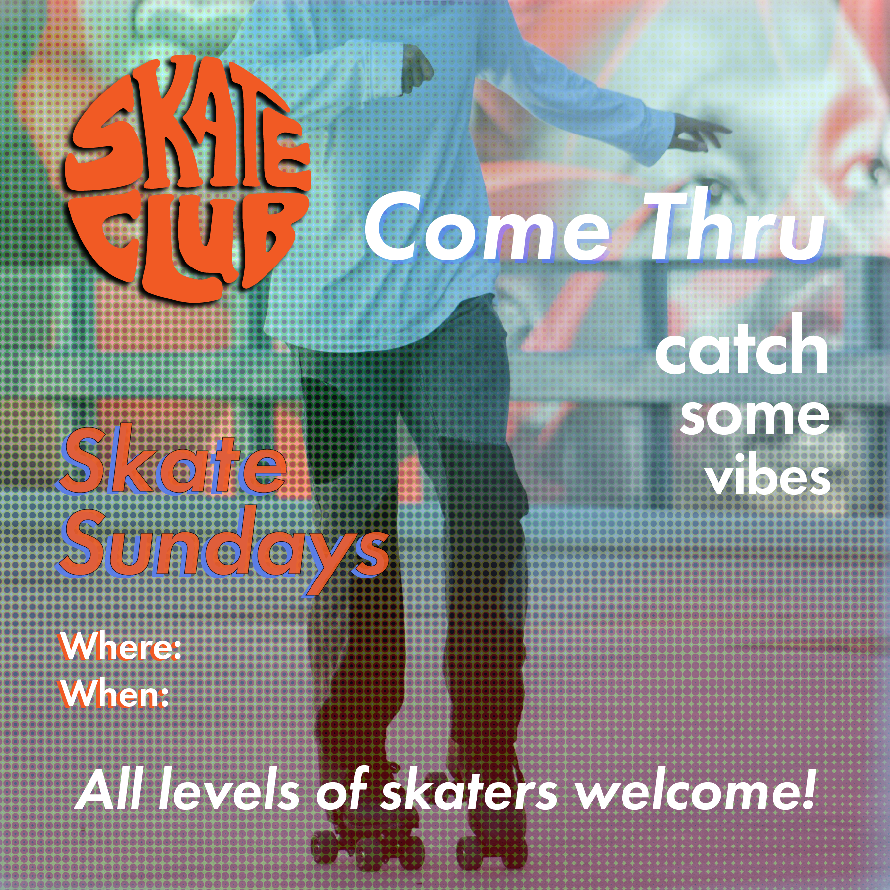
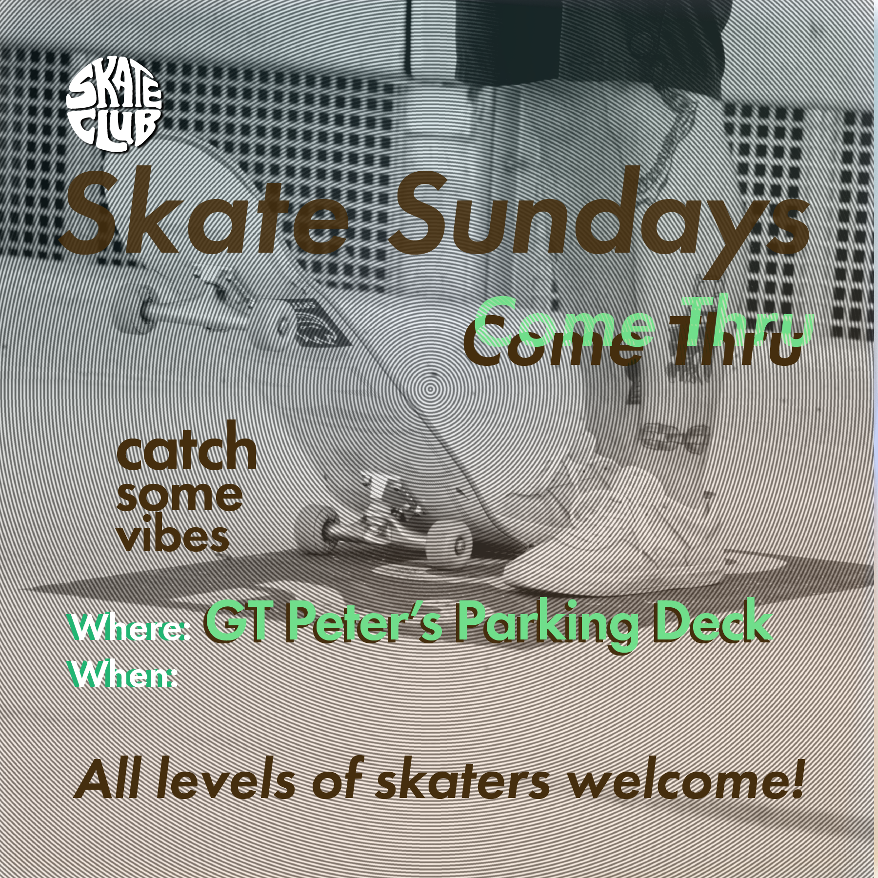
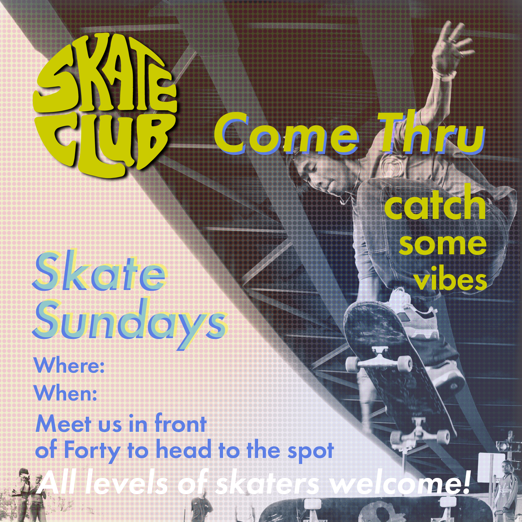
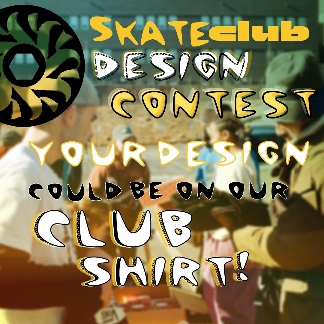
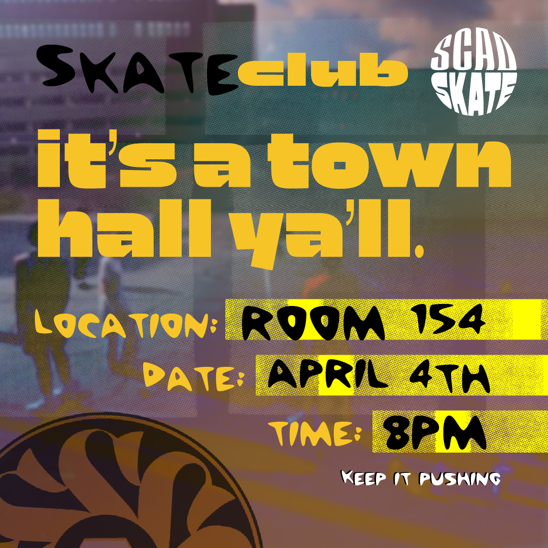
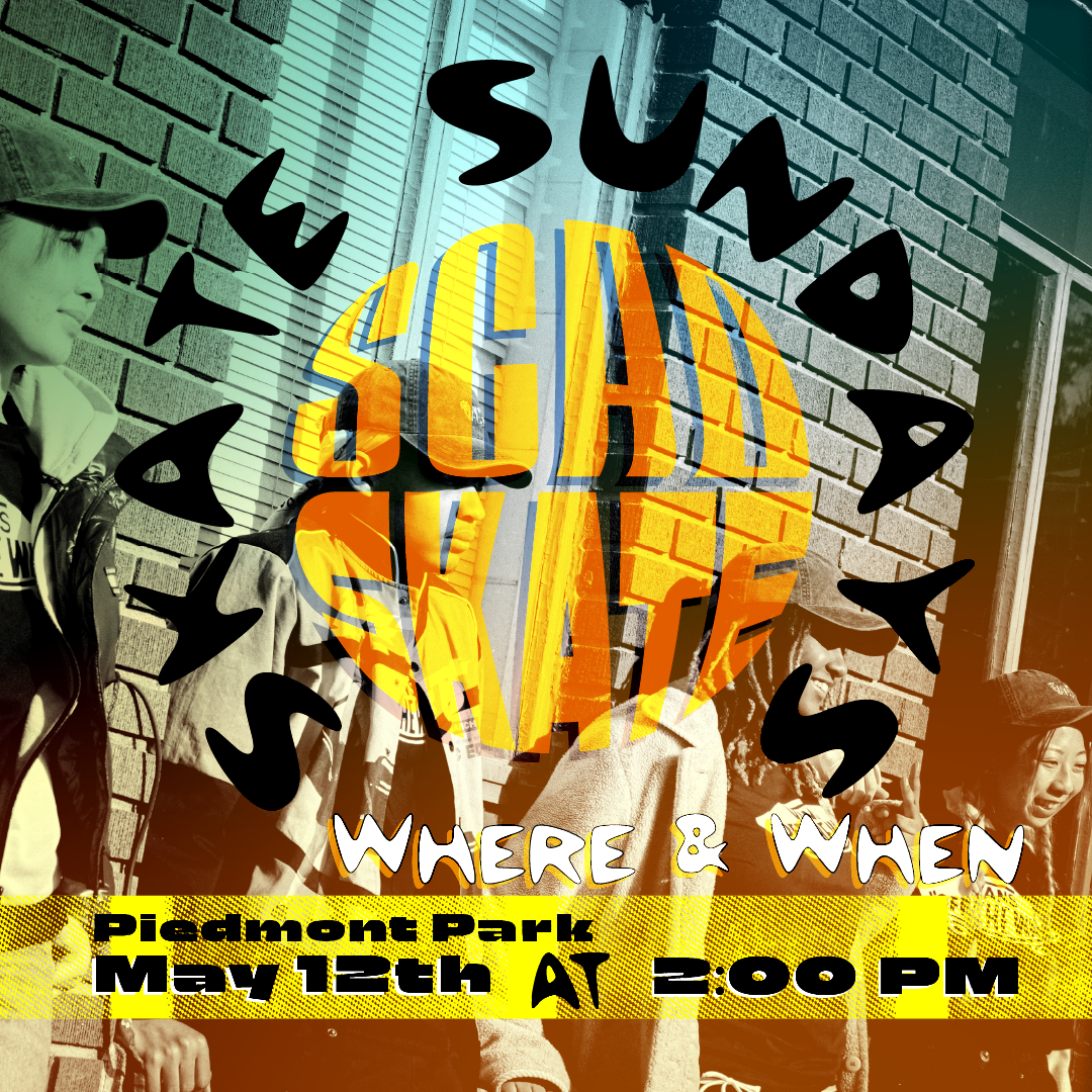
Through the implementation, the why is to establish cohesive visual communication. This provided solutions that generate constant excitement for merchandise, events, and announcements.
weekly Flyers
slogan
original inspiration
wordmark
logo mark


