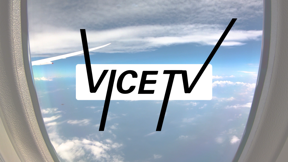
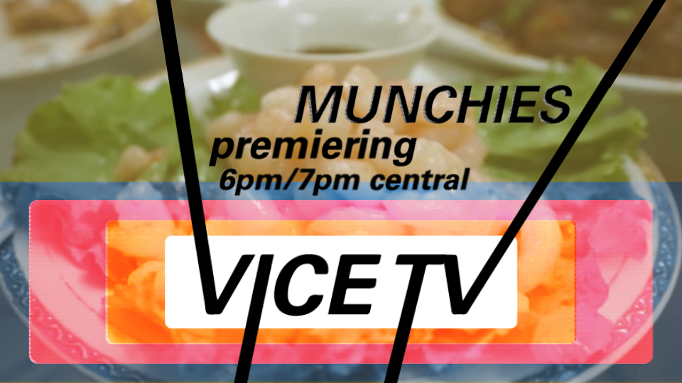
On air promo
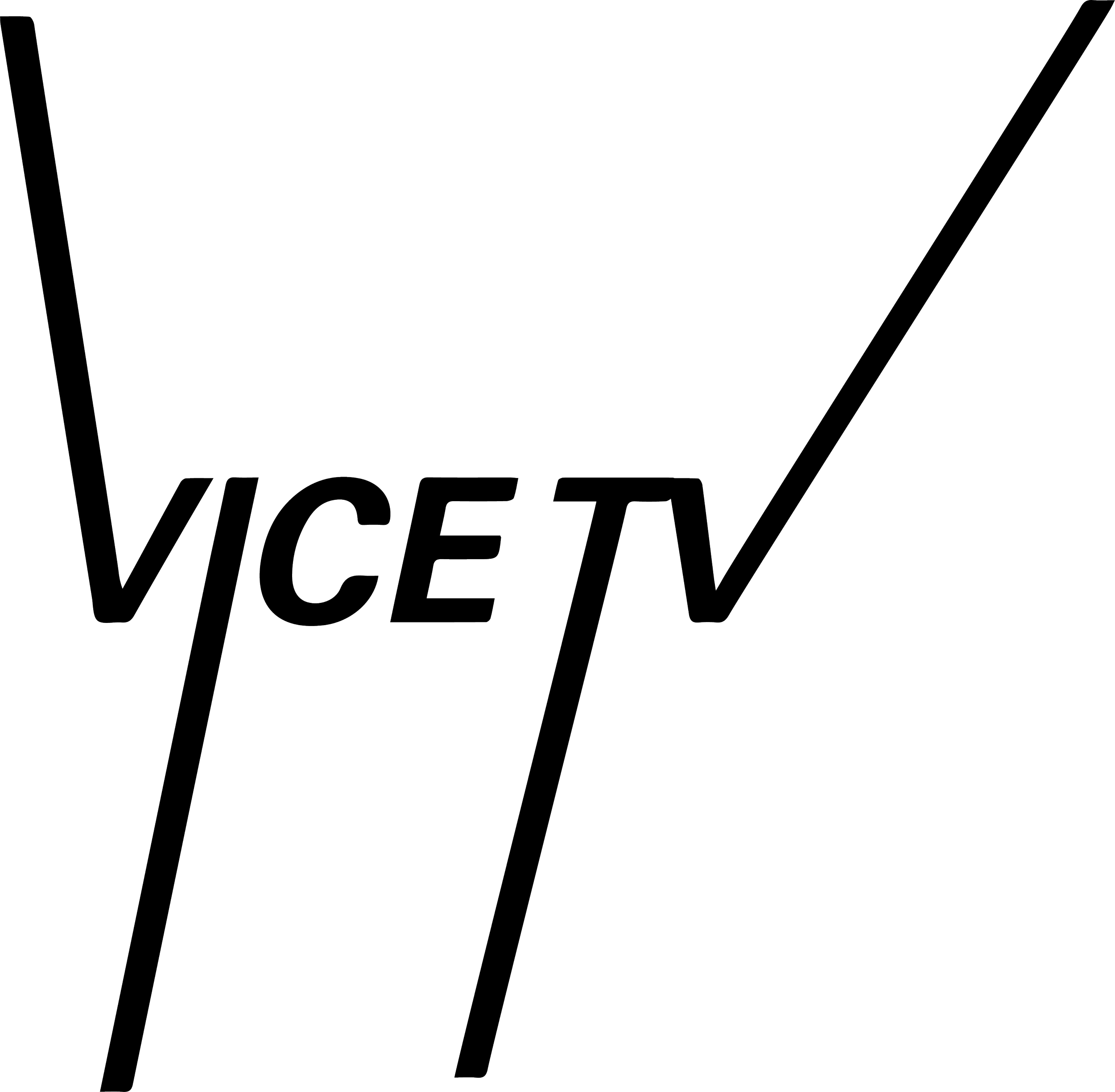
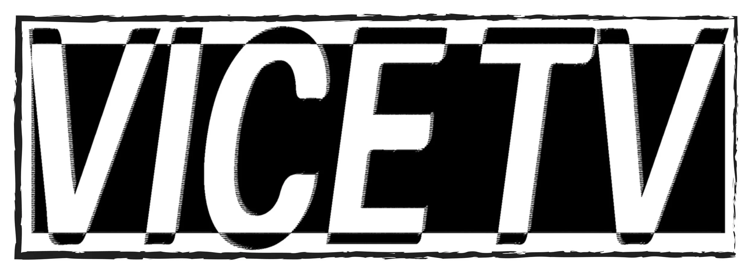
I got to develop branding sytem built on new logo mark. This is an exercise in rebranding Vice Media, with the starting point to be a change in the logo. In using Univers, it brought things into a more fresh perception. Since vice began as a mag, It feels like a logical evolution of the long standing direction.
Vice Media Rebrand
Redesigned wordmark 1
Redesigned wordmark 2
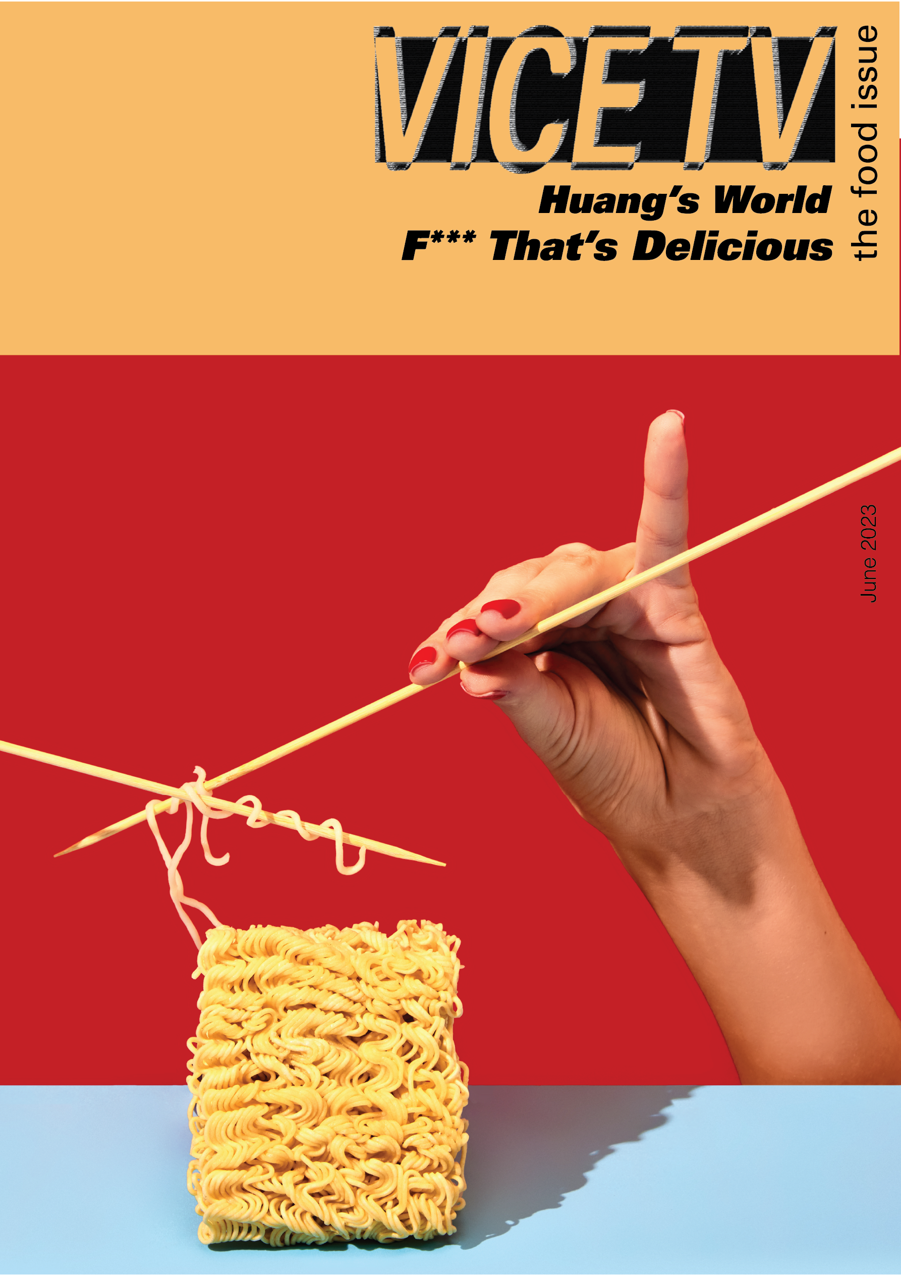
Once that was established, I had to implement it into print and motion applications, so I had the benefit of pulling inspiration from the early editorial beginnings. I Produced two animations to accompany the rebrand, one identity advert, and another on air promo advert.
Final Styleframes
-
Vice Media was once Vice Magazine, and as it evolved over the years, it has changed hands.
Over time, it expanded from print media into both print/digital and eventually phased out print altogether.
It drifted away from it’s more edgy & stylistic roots, and wanted to reconnect with that.
-
Through research, we found that while a plethora of stylistic inspiration is present in skateboarding culture, and used that to dictate type choice, and texture choices.
We found some inspiration in existing skate clubs in other places & took an existing logo, dissected what worked, and elaborated into our own.
By blending 3 marks that could work modularly by existing independently & as one, it provided broader opportunity for deployment. Grittiness was introduced by incorporating texture
-
Through the implementation, the why is to establish cohesive visual communication. This provided solutions that generate constant excitement for merchandise, events, and announcements.
This tone of those covers, the unique compositions were what I took from to form the newer look of the print design.

